Your logo, grown up.
Your business has changed since your first logo. We keep what your customers already recognise and rebuild the rest so the mark fits where you're going next.
Evolve, don't erase.
A redesign shouldn't make your customers wonder who you are. We start from your existing logo and decide, piece by piece, what to carry forward.
Keep what's working
We map every element of your current logo: shapes, symbols, colours and type. Then we find the ones people already connect with you.
Fit the business you are now
New services, new markets, new size. We tie the redesign to where the business is heading, not where it started.
Simplify and rebuild
We redraw the mark so it reads at every size, from a favicon to a job-site sign, with a cleaner palette and type to match.
Make it easy to use
You get a full logo suite, every file format, and a short logo guide so anyone can use it correctly.
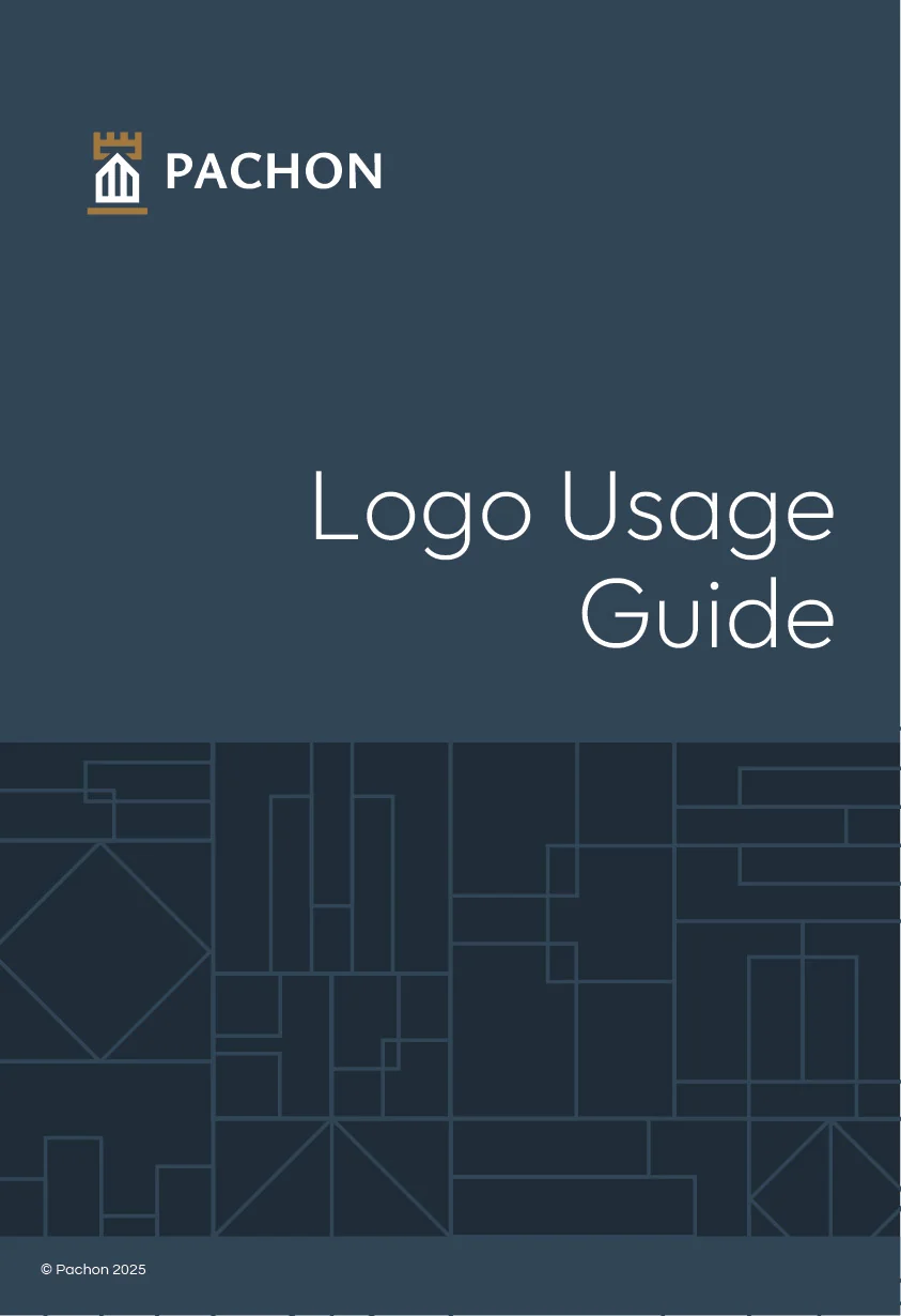
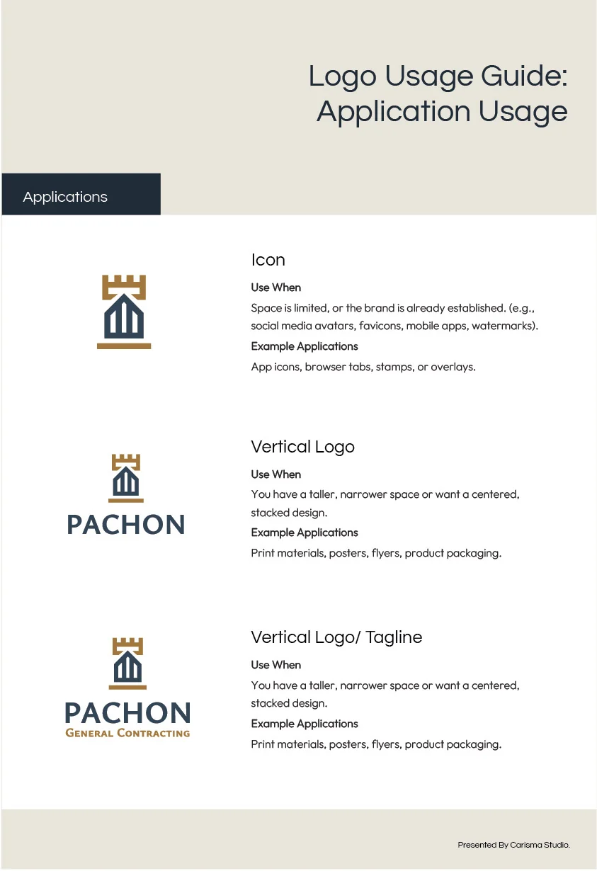
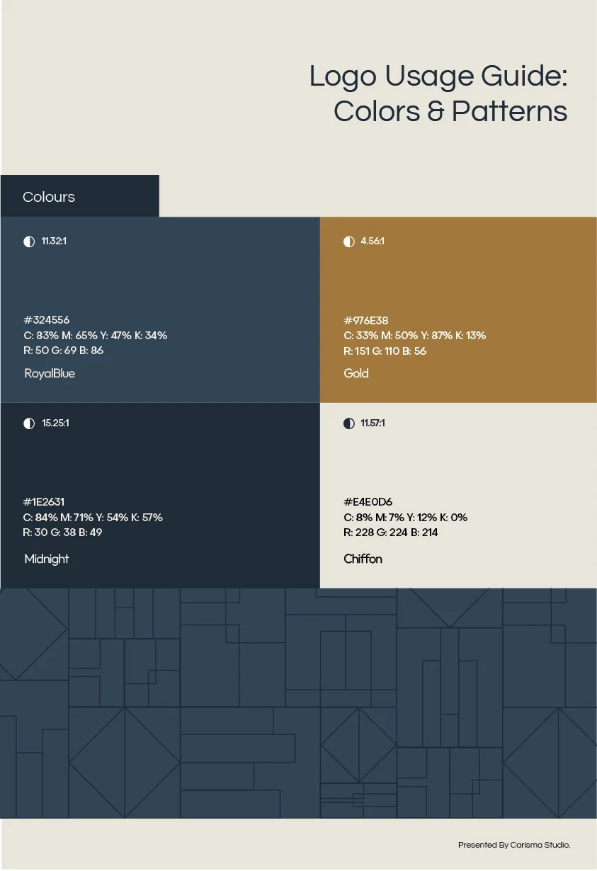
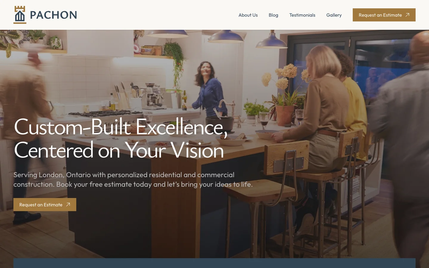
Pachon General Contracting
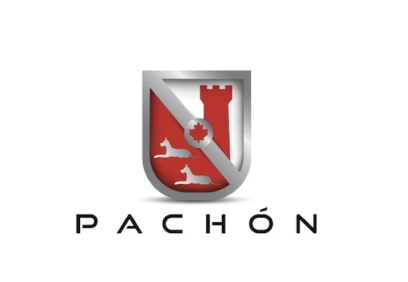
A detailed heraldic crest with a red shield, silver frame, tower, maple leaf and greyhounds. It had real meaning, but it was hard to read small and said little about construction.
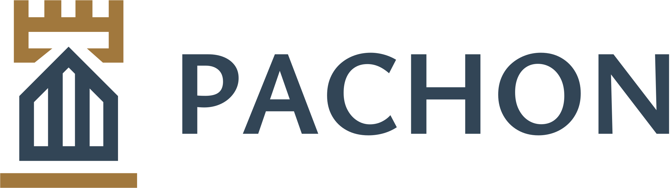
We kept the tower from the crest as a gold battlement, and built a house beneath it. Pachon is moving into new builds, so the house is now part of the logo.
The tower
The tower was the strongest symbol in the original crest. It now sits on top as a simple gold battlement, so the brand's heritage carries over.
A house
Pachon is growing into new home builds. The house below the tower tells customers what the company actually does.
Navy, gold, and clean type
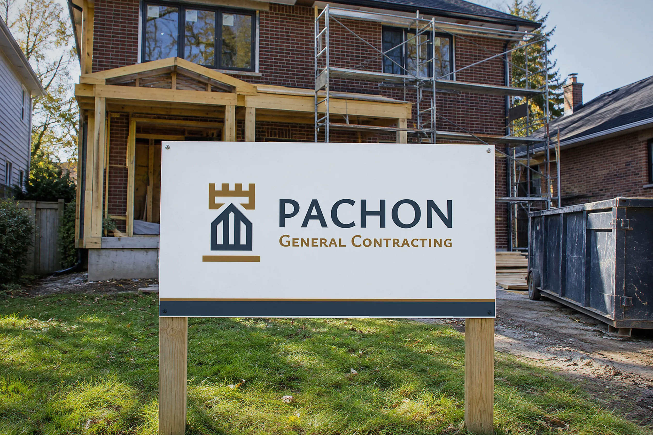
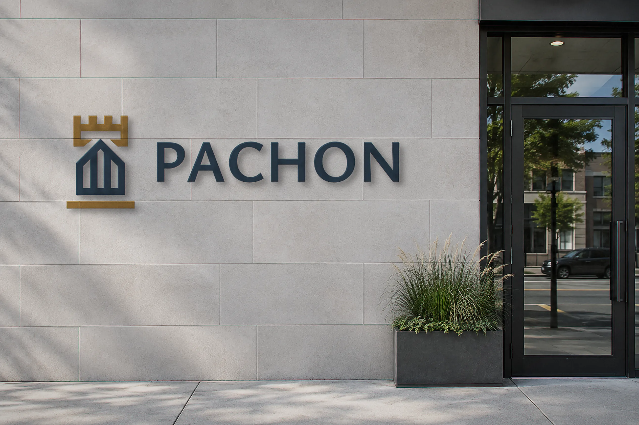
The red and chrome became navy and gold, with a clean wordmark. The logo now works on a job-site sign, a business card and a website header.
Retro Rollers Painting
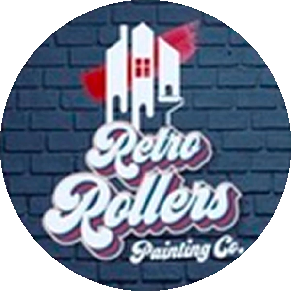
Navy brick, a drippy house and a 70s bubble script. It was full of personality, but busy, hard to read small and tough to reproduce on vehicles and signs.
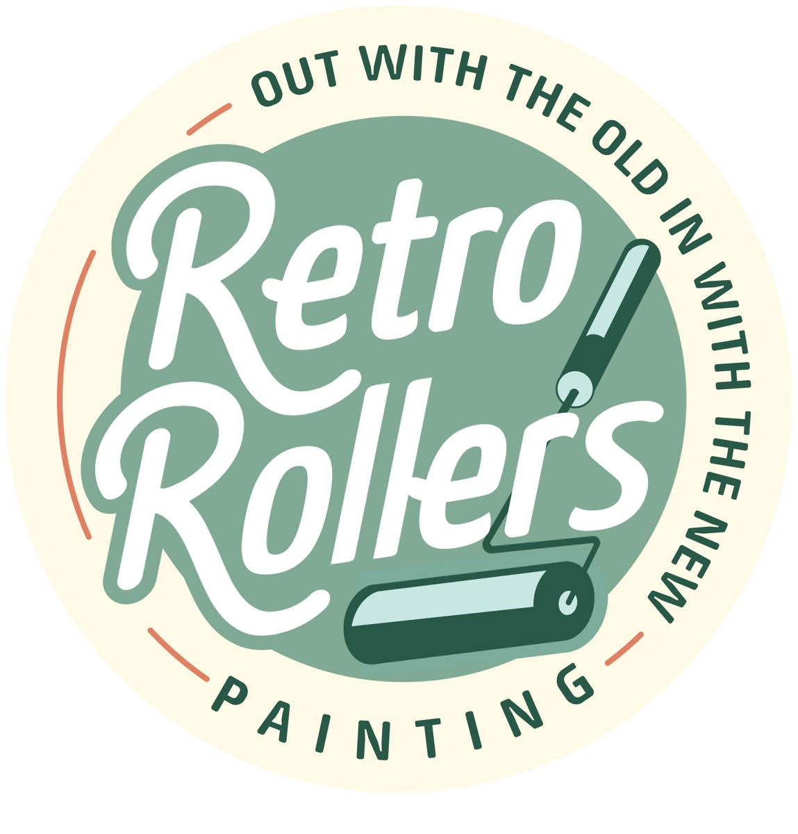
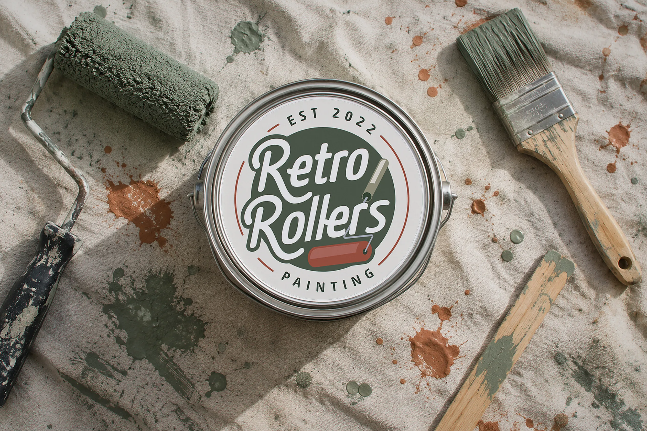
We kept the retro script and the "Out with the old, in with the new" slogan, dropped the brick and drips, and swapped the house for a paint roller in a clean circular badge.
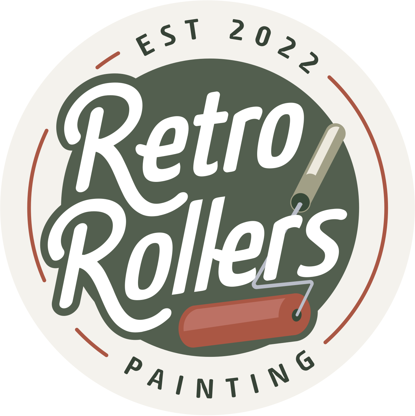
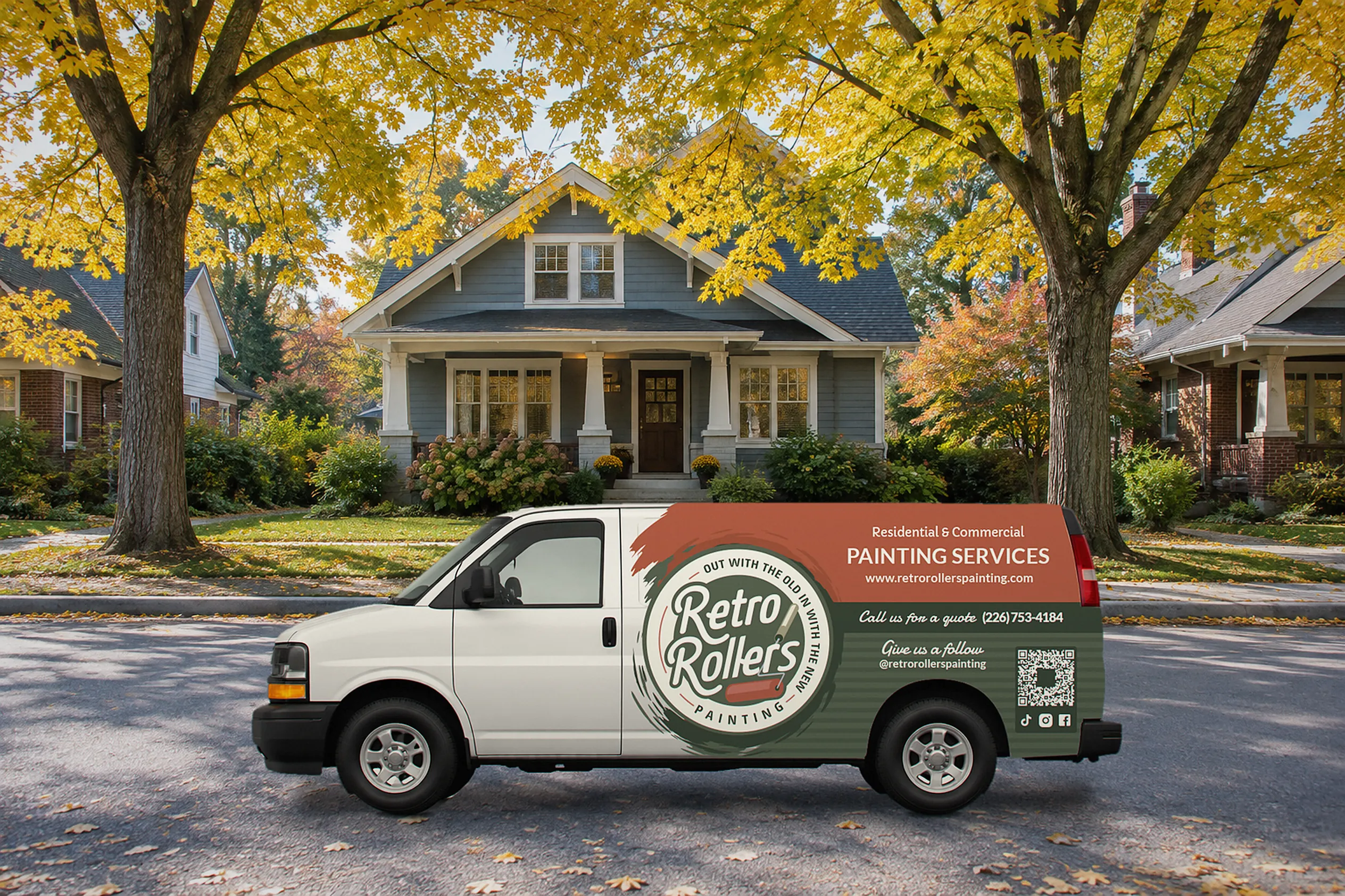
As the company grew, we deepened the palette to evergreen and terracotta and gave it a bolder outline, so it holds up from a van wrap to a hockey arena.
The retro spirit
The handwritten "Retro Rollers" script and the slogan "Out with the old, in with the new" made it through every version. Customers already knew them.
From busy to bold
The brick texture, drips and outlines are gone. A simple badge and a paint roller say "painter" faster and work at every size.
A system, not just a badge
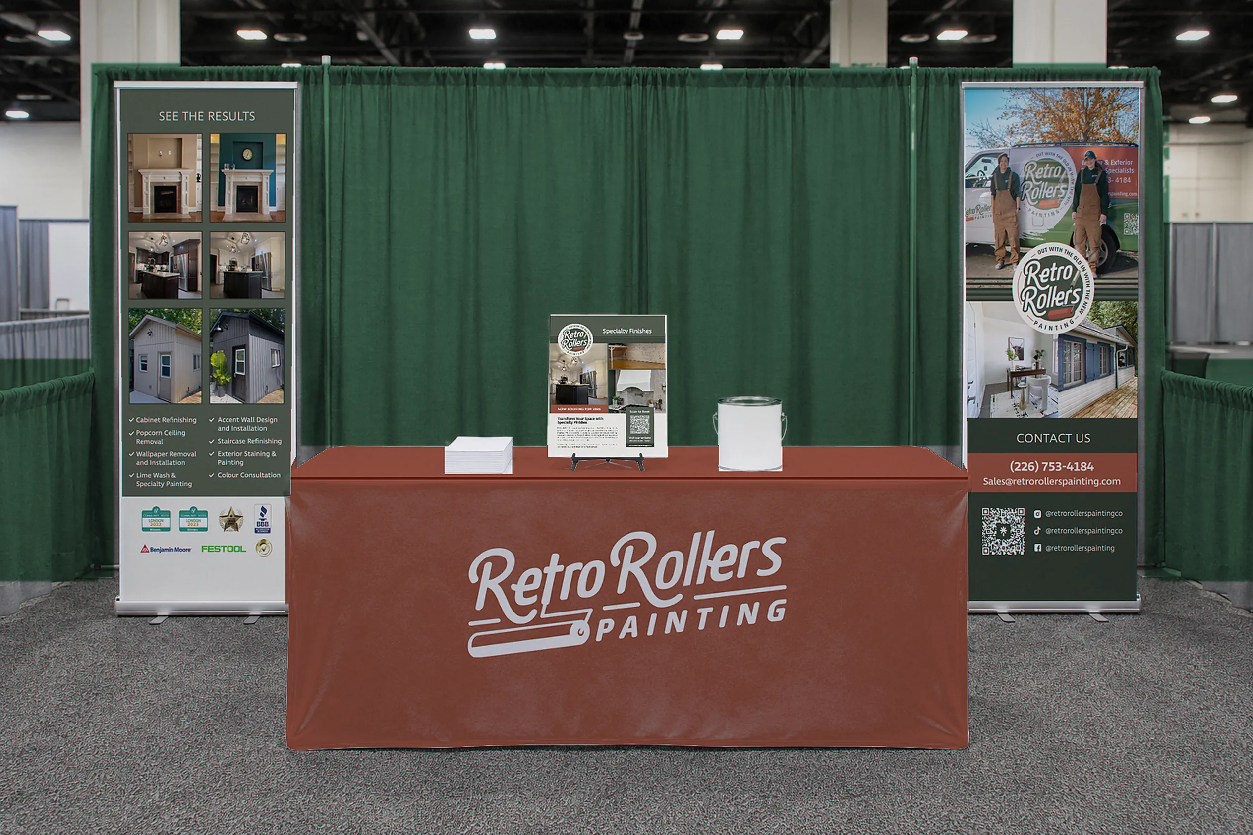
The redesign became a full system: a horizontal logo, a badge, an icon, a van wrap, roll-up banners, a tablecloth, a brochure and arena signage.
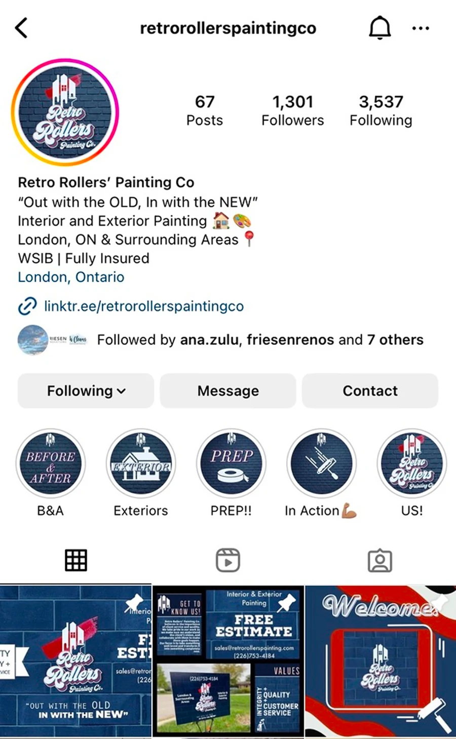
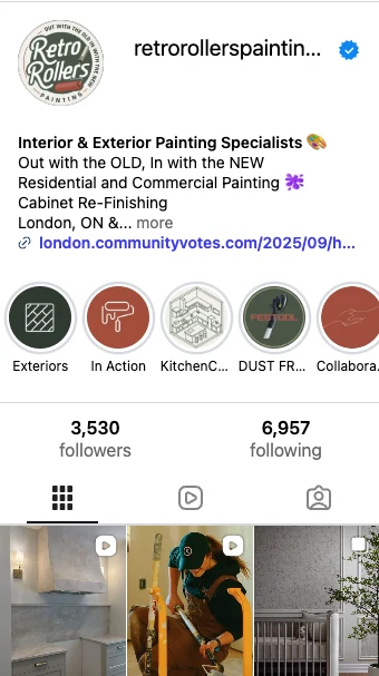
Same account, new presence
The new badge carried through to the profile photo and a matching set of highlight covers in evergreen and terracotta. The feed now looks like one company, from the van to the phone screen.
What's included
Every logo redesign comes ready to use, with no missing files and no guessing.
- Audit of your current logoWhat to keep, refine or retire
- Redesigned primary logoHorizontal and vertical
- Icon and badge versionsFor small spaces and social
- Colour paletteCMYK, RGB and HEX
- TypographyFonts and how to pair them
- Full file suiteAI, EPS, SVG, PNG and JPG
- Mini logo guideDo's, don'ts and file guide
- Optional rolloutSignage, print, vehicles and web
Outgrown your logo?
Send me your current logo and a few lines about where your business is heading. I'll tell you what I'd keep and what I'd change.